As the sun casts its first light on a new day, I find myself reflecting on a journey – not just mine, but ours. The path of Web by Craig has been winding and wonderfully unpredictable, and this year, as we mark our 15th year, it’s the perfect moment to take a stroll down memory lane. You, our cherished client, our community, have been integral in every twist and turn.
Once upon a time, 15 years ago, “Web by Craig” was a mere idea, born from a genuine desire to serve. The world of digital design was like the Wild West – untamed, uncharted, filled with possibilities. Businesses were just starting to realize the untapped potential of the web. And then, like an eager prospector, I jumped in, fueled by a potent mix of passion, naiveté, and a touch of madness.
Over the years, Web by Craig grew. Our projects ranged from the simple to the complex, from local mom-and-pop shops to bustling startups. And with each project, we didn’t just build websites; we forged relationships. Each line of code, each pixel, told a story. Your story.
It’s not just about websites. It’s about communities, dreams, and the brave souls behind every venture. Our success wasn’t measured in the number of sites we crafted but in the countless businesses we elevated. Seeing you succeed, witnessing firsthand the power of our digital creations in driving your growth – that’s been the heartbeat of Web by Craig.
But as with any journey, change is inevitable.
The digital landscape evolved, and so did we. The skills we once deemed advanced became the industry’s basics. Fresh design trends emerged, old ones faded. New platforms rose; others fell. Through it all, our commitment to our mission never wavered.
Yet, as the digital horizon expanded, so did our vision. We wanted to be more than just a web design service. We aspired to be a holistic digital partner, one that doesn’t merely create but collaborates and cultivates.
This dream nudged us towards introspection. What did we want our next chapter to look like? How could we encapsulate our ever-evolving spirit while staying true to our roots?
Enter WBC Designs.
Rebranding wasn’t just about a name change. It’s a symbol, a marker of our evolution. “WBC” is a nod to our origins while emphasizing our broader design focus, our larger team size and ability to handle bigger projects. “Designs” reflects the tapestry of services we now proudly offer from branding and logo design to web and graphic design as well as the ability to design your digital marketing plan and implement it. We literally design for success!
But why rebrand now? The answer is simple: You.
Our clients are diverse, dynamic, and forward-thinking. You’ve grown, adapted, and thrived. Your ambitions have soared, and your needs have diversified. “Web by Craig” was born out of a specific need for web-based solutions. WBC Designs, on the other hand, encapsulates our broader palette of services, sculpted and refined by the myriad needs you’ve voiced over the years.
Don’t get me wrong – the core of who we are remains. We’re still that quirky team that gets giddy over the perfect color palette or spends hours debating the nuances of a font. Our narrative, grounded in community, collaboration, and creation, hasn’t changed. What’s shifted is the breadth of our story, the scope of our canvas.
The road ahead for WBC Designs is shimmering with promise. Our commitment to fostering success, helping businesses big and small make their mark in the digital realm, is unwavering. We’re still the same group of dedicated designers and developers. Only now, we’re decked out with a fresh coat of paint and a sharpened toolkit.
As we unfurl this new chapter, a heartfelt thank you is in order. To every client who trusted a then little-known Web by Craig, to every collaborator who shared our zeal, and to every member of our incredible community – thank you. You’ve made these 15 years a joyous roller coaster.
Here’s to our shared history and the countless stories yet to be written. Welcome to WBC Designs, where your aspirations meet our passion. Let’s craft magic, together.
Cheers to the next 15 and beyond!
– Craig
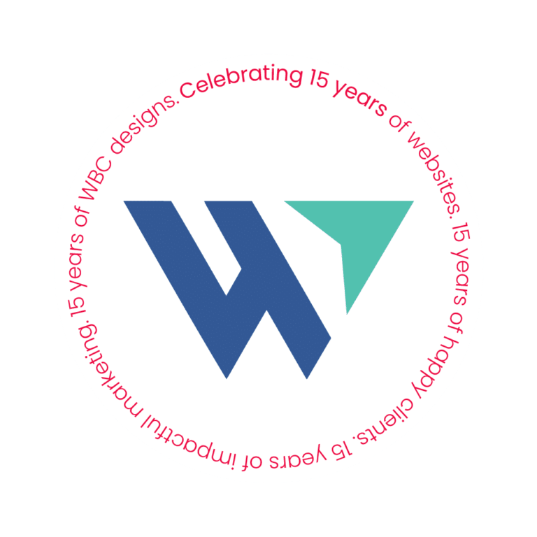
The Evolution of Our Logo


Tag Lines:
Thinking Web? Contact Craig!
Design for Success!
How We Chose This Logo and Why
We started by defining our target audience. Then we decided what look and feel would appeal most to them. The new aesthetic needed to be modern, clean, minimalist and convey our brand ideals.
Like any logo that we design for our clients our own logo needed to meet certain criteria:
- It must be unique
- It must be memorable
- It must be identifiable
- It must be resizable and work in a variety of formats
- It needs to represent our brand
The W is of course a nod to our original name, Web by Craig and to its latest incarnation, WBC Designs. However it is more than that. The arrow in the top right corner represents both the cursor of a mouse click, referencing the many clicks your website and digital marketing campaigns will receive but it is also pointing up and to the right representing the upward trend of a graph implying increased sales, visibility, ranking and more. The two straight lines connected by a smaller one actually form the number 4. This is because we design FOR others. We design for our clients but more importantly we design for their desired audience. We also like to design FOR our community, which is why we have along history of helping out not-for-profits and causes that help make our communities better. Our former twitter handle @design4success shows our tagline that we design for success. Last but not least it shows that our team has grown from one person, Craig, to a team of 4 experts and will continue to grow to meet our clients’ demands.
The Symbolism and Psychology of Colors
When we chose the colors for “Web by Craig,” now rebranded as “WBC Designs,” we wanted every hue to resonate with the brand’s essence. Here’s why we selected these specific shades:
A Deep, Distinguished Blue
Trustworthiness: This shade of blue represents reliability and integrity. It’s a silent promise to every client that they can trust our work.
Expertise: The depth of this blue signifies professionalism. It stands as a nod to our 15 years in the web industry, highlighting a journey filled with knowledge and experience.
Stability: In a fast-evolving digital world, this color stands as a testament to our brand’s consistency and steadfastness over the years.
A Refreshing Teal
Innovation & Creativity: Teal embodies our zest for modern design. It’s a reflection of how we always strive to bring fresh, forward-thinking ideas to the table.
Versatility: A beautiful blend of blue’s reliability and green’s growth, teal is a testament to our ability to cater to varied client needs without compromising on quality.
Engagement: There’s something invigorating about this shade. It perfectly captures the excitement we aim for our designs to evoke in clients.
Together, these colors paint a picture of WBC Designs’ ethos – deeply rooted in trust, brimming with experience, yet ever-evolving and fresh. Every shade is a chapter in our story, and we’re thrilled to share it with you all.
A Vibrant, Bold Pink-Red
Incorporating the Bright Crimson as our accent color is more than just an aesthetic choice. It acts as an exclamation mark in our brand palette, emphasizing our energetic approach and our drive to deliver standout solutions. When combined with blue and teal, it completes our brand story, reflecting a perfect blend of trust, innovation, and fervor.
- Passion: This energetic shade mirrors our undying passion for web design and our dedication to every project we undertake. It embodies the heart and soul we pour into our work.
- Action & Motivation: This hue exudes a dynamic energy, suggesting that we’re not just about words, but also about actions. It’s a hint to our clients: with WBC Designs, you’re setting things into motion.
- Uniqueness: Just as this color stands out in any palette, we ensure our designs are distinctive, allowing our clients to make a memorable impression in their industry.
Two Unsung Heroes
Our color scheme wouldn’t be complete without mentioning the two other colors we employ. Black and White. Without them our color scheme wouldn’t look as modern, clean and minimal as it does and allow it the room it needs to breathe. Often overlook, white space or negative space is an important aspect of our designs.
