
Graphic Design Tips for Beginners: How to Build Skills, Confidence, and Killer Visuals
Starting out in graphic design? You don’t need a fine arts degree or fancy tools to get going—you just need a spark of creativity, a little curiosity, and a willingness to experiment (and maybe hit “undo” a few hundred times). Whether you’re launching a side hustle, building your brand, or finally taking the leap into design work, these beginner tips will help you build a strong foundation and start creating work you’re proud of.
From choosing the right fonts to nailing your colour palette, here’s a breakdown of graphic design essentials without the fluff—just practical advice you can actually use.
1. Know Your Basics: Elements & Principles of Graphic Design
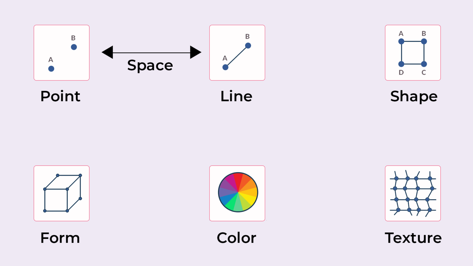
Graphic design is more than just making things look nice—it’s about visual communication. That means understanding and using design elements like line, shape, color, texture, and space to convey a message.
Lines can create emphasis or guide the viewer’s eye.
Shapes are great for organizing content and building logos. Shape need not only be geometrical but can also be organic. The shape formed by living beings is known as organic shapes. Hence, organic shapes are random and irregular.
Color adds emotion and personality—more on that in a sec. The three characteristics of color are:
Hue: Hue is the actual color value of an object. In the circle below, it has a red hue. characteristic of color: hue.
Saturation: Adding white to a given hue will determine the saturation of the color. If we want to create a very saturated image then we add as little white as possible. Now let’s add some white to make it less saturated. characteristic of color: saturation.
Lightness: Lightness determines how light or dark a color is. Adding black to a given hue will determine its lightness.
Texture (like the gritty grain textures trending in 2025) adds visual interest and depth. The texture is primarily identified as the ridges in a surface and the formation of a pattern. Patterns in a surface are used as a decoration structure in design.
Space helps balance everything out. Space can be used to isolate an element in a composition. The blank space around an object is known as white space(negative space). Don’t underestimate the power of white space.
Form is a 3D object with a measurable width, height and breadth. There are three types of form:
Organic forms: Forms that are created or derived from living organisms.
Random forms: Abstract shapes create random forms.
Geometric forms: Forms based on mathematics. A combination of points, lines, and surfaces creates geometric forms.
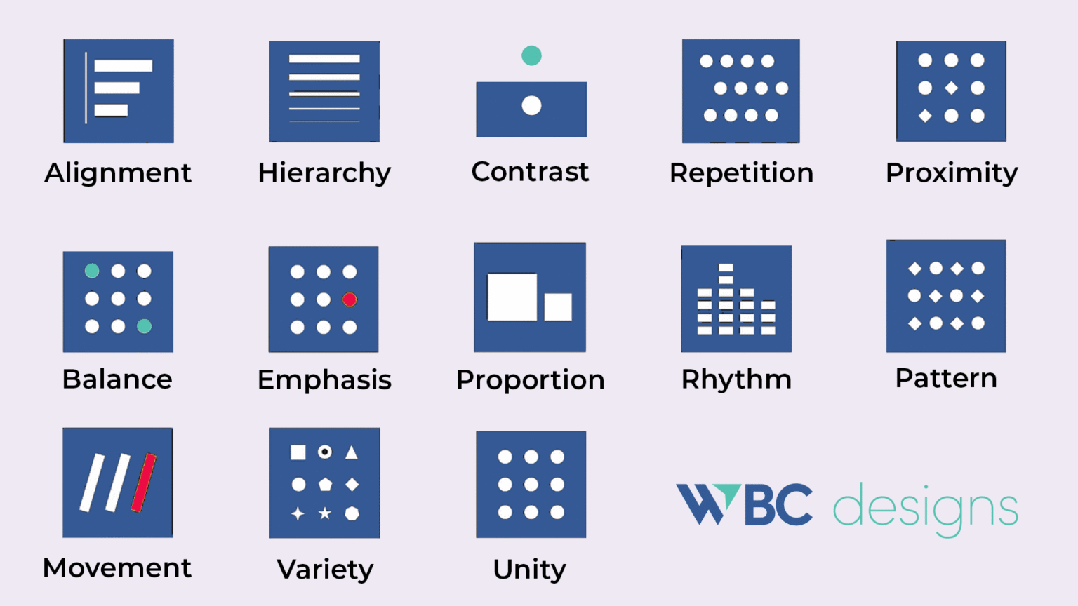
Then there are the principles of design:
Alignment When things line up visually, your design feels clean and organized. Whether it’s text, icons, or images, alignment gives your layout structure and makes everything feel like it belongs. Nothing screams “beginner” like a misaligned button.
- Visual Hierarchy This is how you guide someone’s eye through your design. Use size, color, contrast, and spacing to show people what to look at first, second, and third. If everything is important, nothing is.
- Contrast helps things stand out. It can be light vs. dark, thick vs. thin, or modern vs. classic. A call-to-action button with low contrast? Might as well be invisible.
- Repetition Repeating styles—colors, fonts, shapes—helps tie everything together. It builds consistency, reinforces branding, and keeps your work from feeling random.
- Proximity Things that are grouped together feel connected. Group related items (like a heading and subtext), and keep unrelated elements apart. Clarity comes from clean groupings.
- Balance creates harmony. Balance doesn’t always mean symmetrical. It means the design feels stable. Big image on one side? Balance it with multiple smaller elements or whitespace on the other.
- Emphasis draws the viewer’s focus. Make the most important thing the most visible. Use color, size, or position to highlight key messages. Think: “What do I want people to notice first?”
- Proportion Keep your elements in the right scale relative to each other. Giant logos and microscopic text = rookie mistake. Good proportion makes everything feel intentional.
- Rhythm Design can have rhythm, just like music. Repeating elements at intervals creates flow and consistency. Use spacing, size, and patterns to establish visual tempo.
- Pattern creates consistency. Patterns help create unity, texture, and brand identity. They can be decorative or functional—like background elements or repeating icons.
- Movement uses layout and directional cues (arrows, diagonals, sequencing) to guide the viewer’s eye from one element to the next. Great design tells a story—even in static form.
- Unity ties everything together. Unity is what makes your whole design feel like it belongs together. It’s the glue that holds all the other principles in place. Stick to a consistent style, tone, and spacing across all your assets.
Variety adds life and keeps people engaged. Too much sameness is boring. Try mixing font weights, colors, or textures—but keep it cohesive.
Master these, and you’ve got the groundwork for designs that feel both thoughtful and professional.
2. Master Color Theory Without Getting Overwhelmed
Color isn’t just decoration—it’s a storytelling tool. Understanding how colors work together (and how they affect emotion) is a core graphic design skill.
Use tools like Adobe Color, Coolors, or Pantone Connect to create harmonious palettes.
Current color trends in 2025:
Color clashing (bold, unexpected pairings)
Fluorized colors (high energy neons)
Earthy natural tones (inspired by sustainability and wellness)
Pro tip: Use contrast to improve readability and accessibility. High-contrast text/background combos are key, especially for web design.
3. Typography Isn’t Just Fonts—It’s Voice and Personality
Fonts have personality. Serif fonts feel traditional and trustworthy. Sans-serif feels modern. Script fonts can be whimsical or elegant. Choose based on your message—and don’t overdo it.
Limit yourself to 2–3 fonts per project. Pair a decorative or bold display font with something clean and readable for body text. Bonus points if you master kerning, leading, and tracking.
Typography trends for 2025:
Maximalist typography – Big, bold, oversized type
Retro serifs – Nostalgic fonts with a modern twist
Experimental type – Warped, layered, and interactive lettering
Google Fonts and Adobe Fonts are both excellent libraries to explore.
4. Layouts That Work: Composition & Visual Flow
Good design guides the eye. One of the simplest tools? The rule of thirds. Divide your space into a 3×3 grid and place key elements on the intersections.
Use grids for structure and alignment for polish. Margins and padding matter. Nobody likes a design that feels crammed.
Hierarchy is everything—make sure the most important thing stands out. Use size, color, and contrast to create a clear flow.
5. Tools of the Trade (Even If You’re on a Budget)
You don’t need to go all-in on Adobe right away. Some of the best tools for beginners are free or low-cost.
Industry Standards:
Adobe Photoshop – Photo editing
Illustrator – Vectors and logos
InDesign – Layouts and print media
Budget-Friendly Tools:
Canva – Templates and drag-and-drop design
Photopea – Free Photoshop alternative
Figma – UX/UI design with real-time collaboration (now with AI features)
Affinity Designer – One-time purchase alternative to Adobe
Procreate – iPad sketching & illustration
Krita – Open-source painting tool
A good monitor, fast computer, and optional drawing tablet (like Wacom or XP-Pen) can also upgrade your workflow when you’re ready.
6. Explore Your Style (But Stay Inspired)
Don’t feel boxed into one look. Try minimalism. Try maximalism. Test vintage vibes or sleek modern lines. The best way to find your style? Try everything.
Trending styles in 2025:
Bold minimalism – Clean layouts with loud colour or type
3D surrealism – Blending realism and fantasy
Eco-conscious design – Nature textures and earthy palettes
Maximalist illustration – Detailed, hand-drawn, colorful compositions
Follow other designers on Behance, Dribbble, and Pinterest to spark ideas.
7. Keep It Simple, Keep It Strong
Your design should tell a story—not compete with itself. Focus on one message. Use whitespace to give your content room to breathe.
Use contrast to make CTA buttons pop. High-res images only—no one likes pixelated visuals. And always double-check your hierarchy. If everything is important, nothing is.
8. Get Feedback (Yes, Even When It Stings)
Share your work. Ask for critique. Embrace revision. Feedback from other designers (or even your target audience) helps you see blind spots.
Use platforms like Reddit’s r/design_critiques, design Slack groups, or Discord communities to get insight from real people.
Design is iterative. It’s okay if version 1.0 doesn’t hit. That’s what versions 1.1 through 1.27 are for.
9. Start a Portfolio (Even If You Don’t Have “Clients” Yet)
Your portfolio is your visual resume. Don’t wait for paid gigs—create mock projects for brands you admire or design challenges.
Include personal projects, explain your process, and showcase your thinking. Platforms like Behance, Adobe Portfolio, or even a personal site on Webflow or WordPress work great.
10. Design Is a Journey—Enjoy the Ride
Graphic design is a lifelong skill. The tools will change. The trends will evolve. But your creativity? That’s what sets you apart.
Keep experimenting. Follow your curiosity. Sign up for a Skillshare class, join a 30-day design challenge, or redesign your favorite movie poster just for fun.
The more you design, the better you’ll get. And the more you share, the more you’ll grow.
Need help taking your design skills to the next level? Or ready to level up your business’s branding with some pro help? That’s where we come in. Let’s chat.
